Sunday 12 July 2015

Windsong Alphabet

I love the extra flourish of this font.


The original font has very big flourish loops especially on some of the lower case letters.

For example: the “h” is way taller than the average Capital letter, and the lowercase “g” has an amazingly big loop. If you wanted to do the word “Change” you would need a really big hoop
(The word is 5.27” high and 6.26” wide)


I decided to digitize smaller versions of the letters for those who don't like the extra big letters or who don't have a larger hoop and don't want to keep rehooping. Using the smaller “h” and “g” the word change is now 3.62” high.


Here are the 2 versions of the lowercase letters I digitized


The free trial word for this alphabet is Joy


Amadeus Alphabet

I found this great font - a little bit like Jokerman - but not so overused.  I decided it would make a great basis for my next alphabet.

Digitizing for this one was pretty straight forward - not too many changes after I digitized it.
(So hopefully that means I'm getting better)

My biggest issue was that somewhere along the line - my 8" x 12" hoop developed a problem - there is a sticky strip on the back that has come unglued.   (This reminds me - I really need to find out what Babylock intends to do about that!)

Luckily - this font is a bit smaller than some of my others - so I was able to test easily using my 8x8 and 5x7 hoops

These are the results:  Capital letters in the 8x8 hoop

I did make a few changes after the first stitch out - fixing the small purple lines - and changing the way the N looks.

lowercase letters in the 5x7 hoop


For the free Trial samples - I decided to give you 2 words


If you haven`t already, visit my Craftsy store and get the free trial of this alphabet.

Sunday 28 June 2015

I Love my latest Alphabet

When I started digitizing my latest alphabet, I didn't know how much I would love it.


After digitizing the heart versions of the letters, I decided to digitize plain versions of the letters to allow for mixing them.  

Soon I realized that I could easily see lots of different versions of the balloon alphabet with different fills or embellishments.  Because I was anticipating more versions, I decided to go all out and make a much more complete alphabet.

Heart version of the alphabet - 89 designs
- 30 lower case (a - z, æ, œ,,ø, and a dotless i)
- 29 uppercase ( A - Z, Æ, Œ, Ø)
- 10 numbers,
- 20 punctuation & @ \ ¢ { } $ ! ¡ % £ ? ¿ ( ) / [ ] | ¥ 

Plain version of the alphabet: 129 designs
- plain versions of the heart alphabet plus
- 13 accent marks to be used with the characters (acute, angstrom, breve, caron, cedila, circumflex, dot, double acute, grave, macron, ogonek, tilde, umlaut)
- additional punctuation marks ≈ ' ^ : , ©  - ° ÷ = € < > ≤ ≥ ≠ # . ± +  “ ” ® ; * ~ ™ 

The Alphabet is for sale on my Craftsy and Etsy stores.  Free version of the word "Love" for trial on Craftsy.


Here are some of the options I've been thinking I could persue...


Tuesday 23 June 2015

Sneak peek: next alphabet

I was wondering what to digitize next when several ideas popped into my head.

I think you will LOVE my next alphabet.   I've spent today improving this one until I got to where I love it.


Thursday 18 June 2015

Going overboard?

So I finished my Flowery Flourish Alphabet and posted it for sale on my Craftsy and Etsy stores.

As always I post some letters for free for a Trial so that people can test the way my alphabet stitches out on their machine. For this alphabet, I decided to post the word "Love"


Of course, that made me think that I should do up the words "Live" and "Laugh" to go with them.  The nice thing about this alphabet - even though the capital letters are big, you can actually get some full words in a 4" x 4" hooping.

Then I decided to do "Peace" - another favorite word.  But somehow that didn't seem like enough.  I started looking for other inspirational words.


A few hours later, I had over 60 words done and ready to bundle up for sale.  I decided to add "is" and "and" to help


I had to fight a little bit to get some of the longer words to convert into JEF format, but managed to get them done.


 What do you think? Going overboard or just trying to get it right?

Any other words you would like to see added?


Tuesday 16 June 2015

Why testing is important...

... Especially if you plan to sell your digitized designs


With the machine digitizing software having such great previews, it's tempting to just say, I'm sure I did this all right and it will work perfectly and just send it out.

No matter how careful I am, or how many times I run the stitch simulator in my software, there is always something I miss.  That's why I test all my alphabets before putting them up for sale.

I've recently finished digitizing my Flower Flourish Font. I'm loving the way that it has turned out.


However, you can see that I've had a few glitches in my digitizing that I found on my first test run.

 
Ooops - missed going over some of those leaves.


Oops - I'm sure I set that line to run 3 times - I guess not!

Sometimes you just don't like the way it turns out and want to make some modifications...

The first version:


And the modified final version:


Some other little issues were found too - a few jump stitches, and one or 2 lines going a few extra times.

Are you wondering why I'm sharing my boo boos?   I guess it's so if you are wondering why not all digitizing can be free - think of all the hours that go into making up the designs - the planning, the digitizing, the testing, the fixing, the retesting, the conversion, the packaging them up, the pictures, the listing on a website.   


Wednesday 10 June 2015

New toy

Digitizing my latest alphabet has been going slow.  I've been noticing that my hand hasn't been so thrilled with all of the mouse work. The capital letters are quite intricate and take about an hour each. This is before a test stitch out and tweaking them!

A few days ago I noticed that some of my mouse clicks just weren't being picked up.  I tried a new battery but that didn't seem to help - time for a new mouse.

Last night I was checking out online to see what was on sale and happened upon the graphics input tablet.   All at once the light bulb went on and I realized that I have been wanting to get a tablet to help with my digitizing ever since I started 20 years ago, but I've never been doing enough digitizing to justify it to myself.

Now that I've been digitizing lots of alphabets and other designs, I decided it was time.

My new toy looks like...

It takes a bit to get used to it - it's similar to a mouse but some things are so different.   The first big win that I found is that I'm not having to hold down the mouse button - I think my hand will thank me.

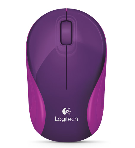
My other smaller purchase was a new mouse.  Just the perfect one for me...


Hopefully at some point in the future I'll remember to give you an update on how it's going!

Monday 1 June 2015

Help! I need your opinion

I've been working on digitizing a new alphabet - and need to make some decisions on which way to go.  I'd love some feedback.  The differences are in the green leaves/stems and the thin blue line that is part of the letter.  Survey at the end - but if you can't see it - feel free to leave comments.

OPTION 1: both are running stitch


OPTION 2: leaves/stems are running


OPTION 3: No running stitch


Create your own user feedback survey

Friday 22 May 2015

Tiger Alphabet

OI've been working on variations of this for a while, but finally found an option that I'm happy with.


It is taking a while to fix the first cut at digitizing to make sure there are no jump stitches between the black stripes.   


I have the basic digitizing done on all the capital letters.   So I still need to add all the connecting stitches as shown in the first "A" picture above and then test them all out.


When you use an alphabet like this one, do you want lowercase, numbers or punctuation or just the capital letters?


One colour version


You can download the X and try it for free on my Craftsy store.  The rest of the alphabet is available to buy in PES, HUS, VIP or JEF formats.

I know everyone likes freebies - but just remember that this represents HOURS of my time.


Monday 4 May 2015

Progressing on my Alphabets

I was a little busy last week so ignored my poor lonely machine.  No progress on my pillow stuffies or on my alphabets.

Yesterday I managed to find lots of time to play with the machine.  I decided to finish testing my Block Floral Alphabet.  Here are the results:


I had just finished uploading a free trial letter (actually 2 letters - the upper and lower case E) to my craftsy store when I decided to move my laptop to the living room so I could finish zipping and uploading the rest of the alphabet to the craftsy store while watching all the good Sunday night PBS shows.  

Alas when I got to the living room I noticed that there was something majorly wrong with the hinge on my laptop.   All thoughts of uploading the designs went out the window and instead I started a backup.

Luckily all the machine needed was the screws tightening - but that was a little scary!  I managed to get PES versions on my store last night - but haven't added any other formats yet.


Fast forward to today - I started testing my Broadway Applique alphabet  which I finished my first cut at digitizing yesterday.   The thread kept breaking so I decided to clean out the bobbin casing - while putting it back together, I managed to totally mess up the machine - not sure what I did, but decided to take it apart again, double check and watch carefully as I put things back.   Was careful about testing (tried some simple sewing before using the embroidery part of the machine) and everything was working great.   I'm hoping that machine problems don't come in threes!

I decided to stop for lunch - realized that I hadn't opened my fortune cookie from our take out last night.  How appropriate...


 The first hoop of test letters - 2 of them needed slight fixes to change the order of stitches and the S had issues - but those were related to all my maintenance on my machine and not being careful about how I restarted the embroidery ... but here's the result

I noticed that the material I was using for the applique - would go well with lots of different colours of thread so decided to try some different threads to see what the effect would be.


I'm happy with the results so far.  I still need to test the rest of the upper case letters, all of the lowercase letters, the numbers, and a select few punctuation that I decided to digitize.


Saturday 25 April 2015

More Pillow Stuffies: Wild Animals

I had to take a bit of a break from the pillow stuffy project as I had to make some custom made video game pillows.

I've received some good feedback from one of my testers so will be updating my instructions a bit.  I've slowly started listing them for sale on my Craftsy Store  but if there is one you want to buy - let me know and I can get it up on the store sooner rather than later.

This was the first of my new ones I made.
Not necessarily a success as not everyone can tell what it is right away - but I guess when you aren't a mainstream animal that is going to happen.

I was shopping on Friday and saw this material with the minky - a little bit stretchier - but every bit as soft.   The horns are felt.


I've been meaning to make a horse pattern and when I saw the zebra print - then I knew it was time.  My son said the mane at the top and the side should be connected so it's  more obvious that it's the continuation of the mane.


I modified the horse/zebra  pattern to include a full mane.


Let me know what you think.